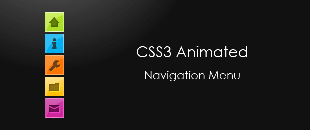
CSS3 Minimalistic Navigation Menu
As you have probably heard by now, CSS3 animations are a powerful tool, which enables you to create animations which run without the need of applying additional scripting to the page. What is even better, in the next generation of browsers we will have even more powerful tools, including 3D transformations (already present in Safari).
But what difference does it make for us today? At the moment only three browsers give you the ability to animate CSS properties - Chrome, Safari and Opera, which together take up only a small part of the browser market. Firefox is expected to soon join the club, and with the impending release of IE9, it suddenly makes sense to start leveraging this technique.
So today we are making something practical - a simple CSS3 animated navigation menu, which degrades gracefully in older browsers and is future-proofed to work with the next generation of browsers.
The XHTML
The menu is organized as an unordered list. This is the most suitable structure for a menu, as it provides an easy way to style the menu links and is semantically correct.
demo.html
<ul id="navigationMenu">
    <li>
        <a class="home" href="#">
            <span>Home</span>
        </a>
    </li>

    <li>
        <a class="about" href="#">
            <span>About</span>
        </a>
    </li>

    <li>
         <a class="services" href="#">
            <span>Services</span>
         </a>
    </li>

    <li>
        <a class="portfolio" href="#">
            <span>Portfolio</span>
        </a>
    </li>

    <li>
        <a class="contact" href="#">
            <span>Contact us</span>
        </a>
    </li>
</ul>
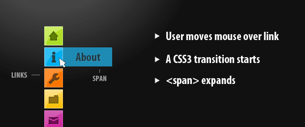
Inside each li we have a hyperlink with a span inside it. By default these spans are hidden, and are only shown when you hover over the link. Each link has a unique class name, which is used to give it a unique background and style the inner span, as you will see in a moment.

The CSS
Once we have the basic structure in place, we can now move to creating the fancy CSS3 effects and styling. This works even on browsers, which do not support CSS3 transition animations (all browsers except Chrome, Safari and Opera, at the moment of this writing) albeit with less glitter. The menu is even perfectly usable in browsers as old as IE6.
styles.css - Part 1
*{
    /* A universal CSS reset */
    margin:0;
    padding:0;
}

body{
    font-size:14px;
    color:#666;
    background:#111 no-repeat;

    /* CSS3 Radial Gradients */
    background-image:-moz-radial-gradient(center -100px 45deg, circle farthest-corner, #444 150px, #111 300px);
    background-image:-webkit-gradient(radial, 50% 0, 150, 50% 0, 300, from(#444), to(#111));

    font-family:Arial, Helvetica, sans-serif;
}

#navigationMenu li{
    list-style:none;
    height:39px;
    padding:2px;
    width:40px;
}
For the styling of the body background, I first supplied a background color, which acts as a fallback, and then added two CSS3 radial gradients (for Firefox and Chrome/Safari respectfully) as background images. If the visitor's browser does not support gradients, it will just ignore the rules and go with the plain background color.
You can see in the styles, that most of the rules are preceded by the id of the unordered list - #navigationMenu. This is to prevent collisions with the rest of your page styles, if you incorporate the menu into your site.
styles.css - Part 2
#navigationMenu span{
    /* Container properties */
    width:0;
    left:38px;
    padding:0;
    position:absolute;
    overflow:hidden;

    /* Text properties */
    font-family:'Myriad Pro',Arial, Helvetica, sans-serif;
    font-size:18px;
    font-weight:bold;
    letter-spacing:0.6px;
    white-space:nowrap;
    line-height:39px;

    /* CSS3 Transition: */
    -webkit-transition: 0.25s;

    /* Future proofing (these do not work yet): */
    -moz-transition: 0.25s;
    transition: 0.25s;
}

#navigationMenu a{
    /* The background sprite: */
    background:url('img/navigation.jpg') no-repeat;

    height:39px;
    width:38px;
    display:block;
    position:relative;
}

/* General hover styles */

#navigationMenu a:hover span{ width:auto; padding:0 20px;overflow:visible; }
#navigationMenu a:hover{
    text-decoration:none;

    /* CSS outer glow with the box-shadow property */
    -moz-box-shadow:0 0 5px #9ddff5;
    -webkit-box-shadow:0 0 5px #9ddff5;
    box-shadow:0 0 5px #9ddff5;
}
The CSS3 transition property is a really powerful one. It enables you to animate changes that occur on a element when a pseudo properties take effect. For example here, when the user moves their mouse over a navigation link, the :hover pseudo-property takes effect, showing the span which is otherwise hidden.
Without the definition of a transition property, this change is instantaneous. But with a transition we can animate it. Here we are telling the browser, that the duration of the animation is 250 milliseconds. You can optionally specify a list of specific properties to be animated instead of all of them.
Transitions are currently only supported in webkit based browsers (Safari and Chrome), but the next version of Firefox is also expected to support them, so we future-proof the script by specifying a -moz-transition.

styles.css - Part 3
/* Green Button */

#navigationMenu .home { background-position:0 0;}
#navigationMenu .home:hover {   background-position:0 -39px;}
#navigationMenu .home span{
    background-color:#7da315;
    color:#3d4f0c;
    text-shadow:1px 1px 0 #99bf31;
}

/* Blue Button */

#navigationMenu .about { background-position:-38px 0;}
#navigationMenu .about:hover { background-position:-38px -39px;}
#navigationMenu .about span{
    background-color:#1e8bb4;
    color:#223a44;
    text-shadow:1px 1px 0 #44a8d0;
}

/* Orange Button */

#navigationMenu .services { background-position:-76px 0;}
#navigationMenu .services:hover { background-position:-76px -39px;}
#navigationMenu .services span{
    background-color:#c86c1f;
    color:#5a3517;
    text-shadow:1px 1px 0 #d28344;
}

/* Yellow Button */

#navigationMenu .portfolio { background-position:-114px 0;}
#navigationMenu .portfolio:hover{ background-position:-114px -39px;}
#navigationMenu .portfolio span{
    background-color:#d0a525;
    color:#604e18;
    text-shadow:1px 1px 0 #d8b54b;
}

/* Purple Button */

#navigationMenu .contact { background-position:-152px 0;}
#navigationMenu .contact:hover { background-position:-152px -39px;}
#navigationMenu .contact span{
    background-color:#af1e83;
    color:#460f35;
    text-shadow:1px 1px 0 #d244a6;
}
In the last part of the styling, we specify 5 different designs for the navigation links. All the background images for the links are contained inside a single sprite file. They have a normal and a hover state one under another. When a hover occurs, the background is offset to show the appropriate version of the background image.
A PSD file is included in the downloadable archive, so you can customize the images as much as you like.
With this our minimalistic CSS3 navigation menu is complete!
Conclusion
Sooner or later, we are going to have a quick access to powerful, hardware accelerated graphics, right in the browser. When this day comes, a whole new world will open to web developers, and we will come even closer to building rich internet applications, which behave exactly like native apps.
Till then, we have to make the best with what we have, and slowly start adopting CSS3 techniques into our work.
What do you think? How would you improve this navigation menu?
Bootstrap Studio
The revolutionary web design tool for creating responsive websites and apps.
Learn more
Beautiful effect
Really good tutorial!
Thanks for share
Awesome And COOL ...
Request Tutorial : Notification like facebook.... ^^V
wow tutorial nice effect. wait next tutorial i think notification like facebook good look
Nice effect
this rocks!
i thought it was in jquery then cus i didnt read the title properly . really amazed with the outcome :D
Holy crap that's sexy.
Thanks very much. I was looking for it
Very beautiful artistic effect. But, for a general-purpose website (for the general public), the webmaster assumes the website visitor either automatically understands the meaning of the icons or is willing to cursor over them to achieve translation. Cute but extra work for the visitor.
lol, you said "webmaster". what year is this?
Very nice! Thanks for the tuto :)
Very nice and beautiful CSS effect
nice a:hover...thanks for tutor...
a cunning method..thanks for tut..
{{{applause}}}
Very sweet implementation Martin. You've done it again!
Thanks for sharing!
nice nice works
thanks for sharing
Baaa, Baaa You make woolly proud....Thanks of the tutorial.
Nicely executed and well designed!
Hey! I Love this design. Is there anyway to make the menu horizontal?
Yes, you can make it horizontal. The problem is that the animation would be troublesome. Are the labels going to expand to the right and move the rest of the buttons (or display over them), or expand to the bottom with a rotated text?
Awesome effect, great share :)
the effect is nice on chrome..
but the hover effect is not that good on firefox
cool navigation menu
Great idea! I lovet it
@romel:Firefox 4 will support transitions.
https://developer.mozilla.org/en/CSS/-moz-transition
Excellent navigation menu and great design.
Nicely executed and well designed!
Thanks for this simple yet very nice menu. I am looking to expand it's capabilities, like "pinning" a menu item (by clicking the menu item to make it stay expanded - clicking it again or another menu item to make it collapse), or adding additional content to the menu items. So not everything can be between the anchor tags. Any suggestions as to how to proceed?
great man,...Damn beautiful
thanks for share
I agree. I would like to have a flyout from this, so that I can have submenu items appear beneath the main menu item that slides out on hover. Can you recommend an approach?
good looking nav, haven't tried it yet but it looks pretty clean, thank-you
so nice it is..will try to modify it my way..thanks for sharing :)
This CSS3 tutorial is great and everything but I downloaded files because I liked this home button and will try to implement it on of of my sites. I think it will be great addition to navigation.
Thanks Martin!
hi, I am looking for similar kind of vertical menu plugin for WordPress.. any help??
Well beyond cool css effect Martin, thank you for sharing it!
Sergio
Hey congratulations for the beautiful menu, but i implemented a simple tag css3 in fill #navigationMenu a:hover{ and #navigationMenu a { the left tag transition: 1s; i got a excellent result.
Amazing css3 ... it's very nice :D
Nice CSS trick i want to try this in my website. I like the way its been organized thank u
Excellent navigation menu and great design.
I really like this navigation, but I am trying to get the span to extend left instead of right.
Any pointers on doing so?
Thanks for sharing such an awesome CSS3 trick :)
Simple and great tutorial, thank you!
Fantastic.. really nice job. Thanks!